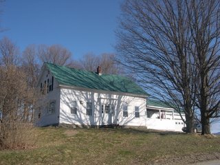
Obsession
 When I started picking a color for the upstairs bedrooms, I let myself in for gentle joshing at the paint store as I came back again and again for more of those little sample jars. I am the target market for that product. At four bucks a pop, I can afford to try colors over and over again, until I get exactly the right one. Upstairs, I went through seven samples before picking Coastal Fog—the first color I started with, but I don’t care because now I am confident that it is perfect. Now, I am attempting to pick exterior colors. Oh, my.
 I live in a classic Vermont farmhouse, which is to say it is a Greek Revival clapboard covered house with a standing seam metal roof. It is currently painted white, and until I ripped them off in a fit of good taste, it had black plastic shutters. I can’t afford to be a preservation perfectionist, but I do draw the line at plastic, non-functional shutters.
I started with the view that it would be nice to have some contrast in the paint scheme to accent the architectural details which now disappear in a blur of white. Historical research is not particularly helpful, since it reveals the following contradictory stances:
1. All Greek Revival houses were always painted white, which was meant to represent pure cut white marble.
2. It is a myth that all Greek Revival houses were painted white—other appropriate colors are light yellow, tan, or gray.
3. Domestic buildings of the period were not generally painted, or if they were, they were painted red or ochre because those paints were the least expensive. Only very wealthy people could afford white paint. This one gets some support from the area uncovered by recent electrical work--deep ochre (yellow) with dark green trim.
4. Buildings that were heavily used and esteemed (churches and meeting houses) were usually painted in polychrome schemes that we would now find excessively bright.
Well, huh. I took a side trip into investigating deeper colors—maybe a nice charcoal gray—then decided that I don’t want to emphasize all the architectural elements of my house. I particularly don’t want to emphasize the slight bow in the roofline, with corresponding swag in the back wall, which I fear a stark contrasting paint scheme might betray. It was nice to think that a darker color might deter my ongoing infestation of ladybugs, which are said to prefer light colored houses.
I have some other constraints—the rather bright green roof and the white replacement windows don’t fit with every color combination, but I won’t bore you with the details of how I have gotten to one possible conclusion: Clarksville Gray with Lancaster White trim. Or maybe Waterbury Cream with Monterey White trim. Or maybe just white.
If I don’t decide soon, I will miss the painting season. Living in a place with a short construction season means that you must line up tradesmen before the snow goes in order to be on their list for that year. Construction workers of every type are thin on the ground in Norther Vermont, one outcome of our booming second home market. I'll allow myself at most another week of obsession, then it will be time to decide.


2 Comments:
At Sunday, 09 April, 2006, Leslie Shelor said…
ALL of this sounds very familiar; I'm very much the same way. The house is lovely; glad you disposed of non-functional black plastic shutters!
At Wednesday, 12 April, 2006, D L Ennis said…
Hi Karen, Lots of work involved in your project. What a beautiful place in the world you live in!
Post a Comment
<< Home